



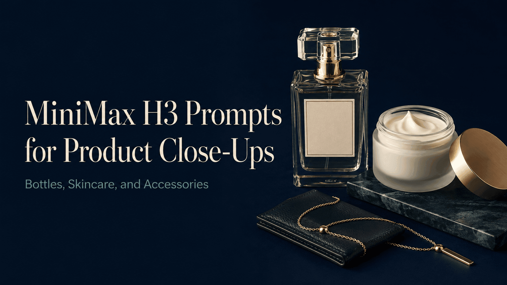
MiniMax H3 Prompts for Product Close-Ups
MiniMax H3 Prompts for Product Close-Ups: Bottles, Skincare, and Accessories
You've picked a good product photo—label is legible, background is clean, colors look right. All you want is a few seconds of motion to drop into a product page or social post.
Then you generate it, and the bottle starts rotating on its own, the cap changes shape, the camera creeps in until you can't even read the product name.
Close-ups do that. The bigger you make something, the more visible the small flaws become. When writing MiniMax H3 prompts for product close-ups, the useful thing is to spell out upfront: what this shot should focus on, where the movement should happen, and which details belong to the product and shouldn't change.
Here are a few examples to try with your reference images. Swap in the product name, material, and lighting that match your own shots.
Check the reference first
Before writing the prompt, zoom in on the photo.
Can you actually read the label? Is the edge of the cap intact? Is that buckle on the bag clearly visible, or is it hidden behind something?
Those things determine how you frame the close-up. If the product is only a small part of the original image and you ask the camera to keep moving in, the model has to invent details that weren't in the photo.
Pick the image based on what you want to capture. If the label is the point, use a front-facing shot. If you want to show the thickness of the glass, a slightly angled view works better. For stitching or jewelry details, have a close-up of that area ready.
Also leave a little breathing room around the product. If the cap is already touching the top edge of the frame, asking for a forward push will just crop it out.
Bottles: keep the label and the shape visible
A glass bottle usually has two things going for it: the shape, and the text on the front.
A reflection can make the glass look great, or it can land right on the product name. A rotation can show off the bottle, but it also turns the label away.
For the first pass, keep the bottle still:
A close-up of the perfume bottle from the reference image. The bottle sits still on the table, and the camera moves in slowly. Keep the front label visible and the cap fully in frame. Soft side light traces the edge of the glass, with the main reflection kept away from the printed text. Preserve the original bottle shape, liquid color, and cap.
After generating, pay attention to whether the bottle widens as the camera gets closer, whether the cap stays stable, and whether the label shifts or slides along the glass.
If that feels too static, try a version with a small lateral camera move. See what that one change does before piling on anything else.
Skincare: separate packaging from texture
A closed cream jar is about introducing the product. An open one is about showing the texture. You can put both shots in the same video, but it's better to prepare separate references.
For packaging:
A close-up of the closed skincare jar from the reference image, sitting on the original surface. The camera pushes in gently, keeping the lid and front label fully visible. Use soft, even light to bring out the container's original surface texture. Preserve the jar's proportions, lid position, color, and printed details.
For texture, start with a photo where the cream is already visible:
A close-up of an open cream jar from the reference image. The camera moves slightly closer to the visible cream surface. Soft side light shows the original swirl pattern and texture. Keep the cream's color and shape as they are. The jar and cream stay still.
If all you have is a sealed packaging shot and you ask the video to open the lid, the model has to guess what's inside. For real product footage, a quick shot of the opened jar will help a lot.
Also be accurate when describing the texture. “Clear, watery gel” and “thick, matte cream” suggest two very different things, so write what the product actually is.
Accessories: be specific about the material
Necklaces and leather wallets call for different kinds of emphasis.
Metal works well with a slight reflection to show the surface. Leather benefits from side light to make the grain and stitching more visible.
Necklace prompt:
The necklace is arranged as in the reference image. The camera moves sideways a small amount, and the necklace stays in contact with the original surface. Soft light creates a subtle reflection on the metal. Keep the pendant shape, chain arrangement, and gemstone color.
Leather accessory prompt:
A close-up of the leather wallet from the reference image. The camera moves slowly along the visible stitching. Soft side light brings out the leather texture and thread. Preserve the original color, stitch placement, and metal hardware. The wallet stays still.
Try to build the camera move around what you can already see in the photo. Following a line of stitching is easy to check afterwards. If the shot travels from the zipper to the strap and around the back, you'll have a lot more to verify.
Adapt the prompt for a different product
You can start with this template:
Show the [product or detail] from the reference image, using [one camera move], with [specific lighting], keeping [important visible features].
For example, for sunglasses:
Show the sunglasses from the reference image, with a slow forward push. Use soft light to bring out the frame edge. Preserve the lens color, frame shape, and hinge detail.
Then add more based on what goes wrong. If the camera keeps cutting off the product, specify the full composition. If the surface looks too glossy, write down whether it's actually matte, satin, or polished.
Words like “premium” or “cinematic” can add atmosphere, but on their own they don't tell the model what the product or camera should actually do.
Before you pick a final version, check the product
Reveedo has a MiniMax H3 model option. When testing, upload your image, fill in the prompt, and pick the settings according to the current generation interface.
When you tweak a prompt, keep using the same image and settings so you can tell whether the change actually helped.
After generating, play it through once, then pause at the start, middle, and end. Check the label, silhouette, cap, and metal parts. Saying “keep the logo” in the prompt is a request, not a guarantee—always compare against the original image.
If the label has already changed, fixing the background color won't help. Instead, reduce the camera movement or use a reference where the label is sharper.
If the product itself looks fine but the framing is too tight, adjust the composition on its own:
Keep the full product in frame for the entire shot. Stop the forward movement before the cap or base gets close to the edge.
Save the final video along with the prompt. Next time you make a similar product video, you can start from that version instead of guessing every line again.