



AI Camera Movement for Home Interior Photos
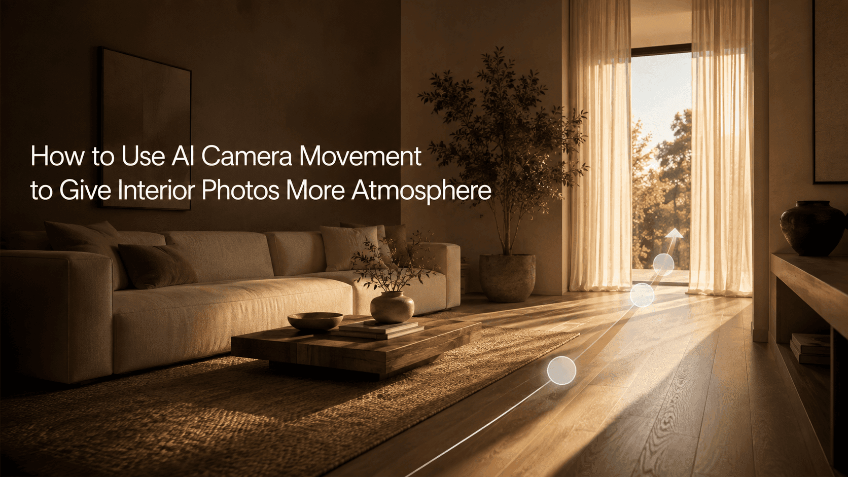
How to Use AI Camera Movement to Give Interior Photos More Atmosphere
An interior photo can tell you what a room looks like, but it doesn't always make you feel the mood of the space. The camera drifts slowly toward a chair by the bed, sunlight falls across the table, the curtain moves just a little—and suddenly a still image feels like someone just walked in.
When making this kind of video, fancier camera work doesn't automatically mean a better result. Interiors are full of straight lines, furniture, and all kinds of small details. If the camera moves too fast, walls, window frames, and columns can start to look unstable. In most cases, a slow push-in or a gentle pan is all you need.
Once you upload an interior photo to Reveedo, you can start with a simple camera move like that.
Start with a photo that already has some depth
The best interior shots for AI camera movement usually have a foreground, a middle ground, and a background. For example, a sofa with a window behind it, a dining table leading into the kitchen, or a hallway that opens into a brighter room at the end. When the camera has somewhere to go, the frame doesn't feel flat.
Wide-angle photos work really well, but try not to have furniture crammed right against the edges. Leave a little empty floor, wall, or window space in the image so the movement feels more natural. Very dark rooms, heavy glass reflections, or photos with awkwardly cropped furniture are best avoided on your first try. These images aren't impossible to work with, but they're more likely to warp during motion.
Decide where viewers should look first
Before writing a prompt, figure out the one spot in the room you most want people to notice. It could be the light from a window, a dining table, a fireplace, or a floor lamp next to a chair. The camera should lead the viewer's eye there.
If the focus is by the window, at the bedside, or on the dining table, a slow push-in usually works well. It's like taking a small step forward without breaking the sense of space. If you want to show a wider area—like moving from the living room sofa to the floor-to-ceiling window—a slow pan feels more natural.
If the room is already quite open, the camera doesn't need to travel far. A small forward movement can already give a still photo a bit of breathing room.
Three camera moves that are easy to start with
Slow push-in
This is the safest choice. The camera just eases closer, which suits bedrooms, living rooms, or corners with a key piece of furniture.
The camera slowly pushes in toward the armchair by the window. Keep the room layout, furniture, colors, and proportions unchanged. Warm morning light, curtains moving slightly and naturally, calm and cozy atmosphere.
Gentle horizontal pan
If the room has a strong horizontal visual line—like a sofa, a long kitchen counter, a wall of framed pictures, or a row of windows—try a pan. Keep the speed very low. When the camera sweeps too quickly, straight walls and window frames tend to look wrong.
The camera pans slowly from the sofa toward the sunlit window. Keep the walls, furniture, and window frames straight and stable. Soft afternoon light, realistic interior feel.
Slight tilt up or tilt down
For spaces with high ceilings, pendant lights, or tall windows, a slight upward tilt can work well. If you want to highlight a dining table or coffee table, a gentle downward look can help. The movement doesn't need to be big—think of it as adjusting your gaze, not flying a drone through the room.
The camera tilts up slightly to reveal the pendant light and tall windows. Keep the spatial structure and furniture positions unchanged. Natural daylight, slow and steady movement.
Add one small detail and stop there
Once you've decided on the camera move, add a single natural detail. Curtains stirred by a breeze, sunlight shifting slowly across the floor, steam rising from a cup of coffee on the table, or leaves on a plant near the window moving slightly.
Don't throw all of these in at once. Interiors already have a lot going on, and too many moving details will start to look fake. A bright kitchen suits added sunlight; a reading corner suits moving curtains; a nighttime living room suits softer light from a table lamp. Pick one detail that fits the scene.
Make sure it still feels like the same room
After generating, don't just judge the mood. Check the beginning and the end: Are the furniture pieces still in the same places? Are the wall lines straight? Has the window shape changed? Do the bed, cabinet, table, and other large objects still have the right proportions?
If the room starts to drift, simplify the prompt first. A single "slow push-in" is easier to keep stable than "push in, pan, tilt up, pull back." It also helps to explicitly state what should stay the same—like the furniture layout, architectural lines, wall color, and main objects in the room. That kind of instruction is more useful than saying "more cinematic."
How to use it for different content
For real estate or property showcases, steady and restrained camera moves help people understand the space. For furniture or home content, move slowly toward the product and let the surroundings stay calm. For short social media clips, you can warm up the light or let the curtains move a little, but keep the camera simple.
The same interior photo can produce different versions. A daytime living room might work well with a push toward the window; an evening version could pan slowly toward a lamp. You don't need to redesign the whole room each time—just change what the viewer is meant to focus on.
Different rooms can call for different moves
You don't have to use the same camera movement in every space. A small kitchen counter usually suits a slight horizontal pan. Moving along the counter shows the details without forcing the camera into a tight space. A bedroom often feels better with a slow approach toward the bed or the window—it's a calmer rhythm. A living room can follow its natural sightline, like moving from the sofa to the coffee table, or easing from the doorway toward the main seating area.
For bathrooms and narrow hallways, be more conservative. These spaces have lots of straight lines, mirrors, and objects close to the lens. If the camera travels too far, tiles, door frames, and mirrors are more likely to look distorted. If the movement feels "a little too subtle" in the preview, that's often a good sign. You can always add a bit more in the next version. Going too aggressive at the start is much harder to fix later.
When the first version is close, change only one thing
Most of the time you don't need to rewrite the whole prompt. If the room looks fine but the camera is too fast, just slow it down. If the camera is stable but the frame feels flat, add a little daylight change or a slight curtain movement. Changing too many things at once makes it hard to tell which part actually improved the result—and harder to repeat it next time.
If you get a version that's close to what you want, save it. Whether you're working on the same property listing, the same set of furniture, or a series of home content, it gives you a starting point for the next adjustment instead of starting from zero every time.
One last thought
Good AI camera movement for interiors usually doesn't make people notice "there's an effect here." They just feel the room has a bit more warmth and want to look at it a little longer.
Start with one photo, one focal point, and one camera move. Once that version feels stable, then try changes in lighting or a second type of movement. For interior spaces, holding back a little often looks better.