



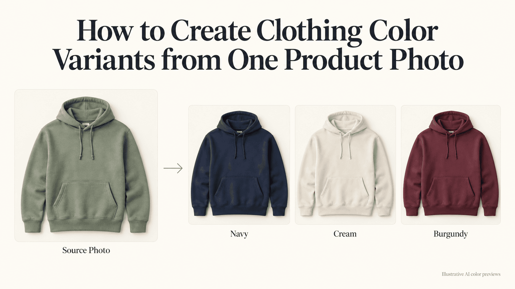
How to Create Clothing Color Variants from One Product Photo
How to Create Clothing Color Variants from One Product Photo
The green hoodie has the best photo. The sleeves sit neatly, the fabric is clear, and the background needs almost no work. The navy version was photographed closer to the camera. The cream sample hasn’t arrived yet.
You could use the images as they are, but switching between colors would also change the size and position of the garment. It makes a simple comparison harder than it needs to be.
Creating clothing color variants from one photo can help you build a more consistent set. Start with the image that shows the product clearly, then use it as the reference for each new shade.
Just keep the drafts separate from approved product images. A convincing recolor is not proof that the real garment looks exactly that way.
Choose the source for your clothing color variants
Look for a photo where you can see the details you’ll need to preserve: the neckline, sleeve ends, seams, pockets, and fabric surface.
It doesn’t have to be the lightest color. A pale garment with blown-out highlights can hide just as much detail as a dark one photographed in shadow.
Check the crop, too. If the original cuts off a cuff, recoloring it won’t tell you what the missing cuff should look like. For a front-view product image, choose a source that already contains the whole garment.
Once you’ve picked it, keep an untouched copy. Make each color from that file. Don’t turn green into navy and then use the navy result to make cream. If the first edit changes a seam, that change can follow you into the next version.
Decide what “the same product” means
Before opening the editor, check whether color is really the only difference.
A hoodie might use matching drawstrings in one shade and contrasting drawstrings in another. The logo could switch from white to black. Buttons, zipper tape, or stitching might also vary.
Write those differences down. Otherwise, it’s easy to approve a good-looking picture that doesn’t match the item.
For a small collection, a note like this is enough:
Navy hoodie: navy body, black drawstrings, white chest logo. Keep the original fit and construction.
Use information from the actual sample or approved product specifications. If nobody has confirmed the trim yet, label the image as a concept. Don’t let a generated detail quietly become a product decision.
Make one test image first
Upload the source to Reveedo’s AI Image Editor. It supports editing an existing image through written instructions, including what to change and what to preserve.
For a hoodie, you could start with:
Recolor the existing hoodie navy blue. Keep the same fit, hood shape, sleeves, cuffs, hem, pocket, seams, and visible fabric texture. Keep the drawstrings black and the chest logo white. Preserve the background, lighting, camera angle, and crop. Do not redesign the garment or add details.
Adjust the trim instructions to match your product.
For now, leave out requests such as “make it more premium” or “improve the lighting.” You’re trying to find out whether the color edit works. Changing the presentation at the same time makes that harder to judge.
If you have a color code, record it with the draft. You can include it in the prompt, but don’t treat the result as a verified color match. The final image still needs comparison with an approved reference or physical sample.
Put the versions next to each other
Open the original and the first recolor at the same size. Look past the color for a moment.
Is the pocket still in the same place? Does the shoulder line match? Has the sleeve become narrower? Is the hoodie suddenly longer?
Small differences can be difficult to notice when you inspect each image on its own. Side by side, they are much easier to see.
Then check the surface. A cotton garment shouldn’t become glossy simply because it is now navy. A pale version should still have enough shading to show its folds.
If the shape has changed, return to the source and try again. Don’t stretch the finished image to force it into alignment; that can distort the garment further.
Once one version passes those checks, use the same basic instructions for the remaining colors. Change only the parts that genuinely differ.
Give light colors a separate review
Cream and white versions deserve more than a quick glance.
A dark garment may hide details that become prominent when recolored. The editor might fill those areas with plausible folds or stitching, but plausible isn’t the same as accurate.
There’s also the real product to consider. A light colorway may show seams, layers, or the garment underneath differently. You can’t confirm those things from a dark sample alone.
Use an unverified image for planning, not as the only evidence of what a customer will receive. If a detail matters to the purchase and you can’t check it, photograph that colorway.
Keep the files boring and easy to identify
After a few attempts, filenames such as final-2-new stop being useful.
Name each approved image by item, color, and view. For example:
hoodie-navy-front.webphoodie-cream-front.webphoodie-sage-front.webp
Keep drafts in a separate folder. Export the approved set with matching dimensions, crop, and space around the garment.
That consistency matters when customers switch between color options. The product should stay in roughly the same position, so their attention goes to the shade rather than a jumping image.
Check the actual store page before considering the work finished. Click each swatch on a phone. Confirm that navy opens the navy image and that an old draft hasn’t been assigned to cream.
Keep the source photo, prompt, and approval notes together. When another color arrives, you’ll have a clear starting point instead of several similar files and no memory of which one was used.
The finished set should make choosing easier. If every image looks tidy but represents a slightly different garment, the job isn’t done yet.