



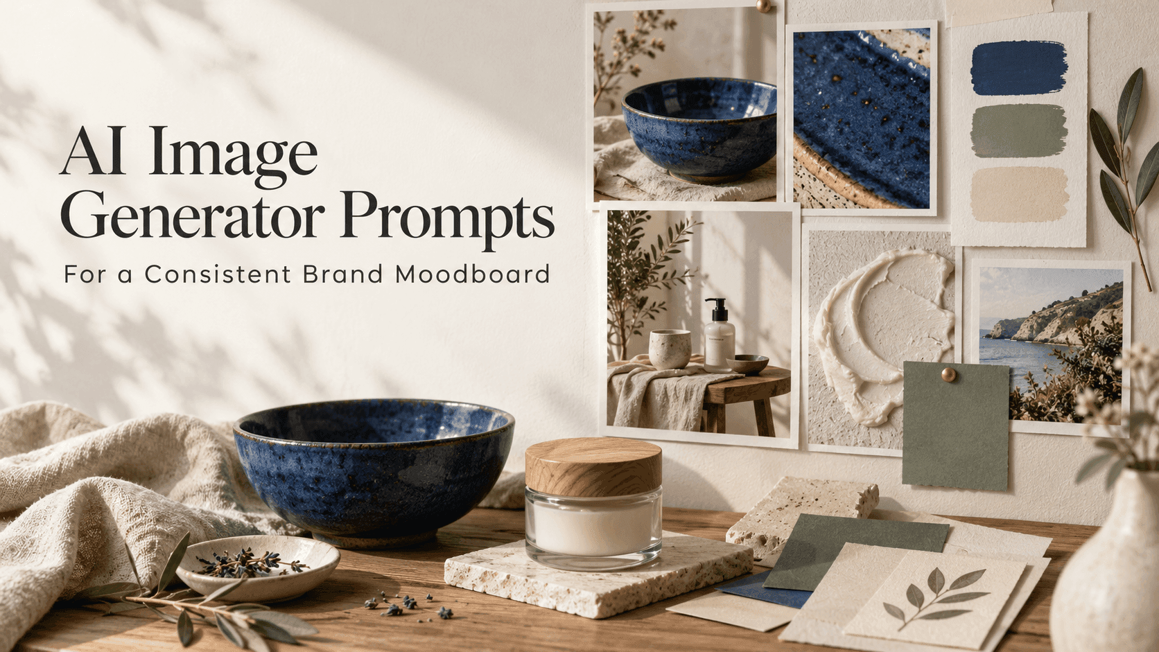
AI Image Generator Prompts for a Consistent Brand Moodboard
AI Image Generator Prompts for a Consistent Brand Moodboard
Imagine a small ceramics studio getting ready to launch a new collection. The pieces are handmade, slightly irregular, and glazed in blue. The owner wants a moodboard for the launch, but the first batch of images feels like it came from five different brands: one is glossy and bright, another is dark and rustic, and a third looks like a hotel catalogue.
The problem usually isn’t a lack of ideas. It’s that each image was prompted from scratch. AI Image Generator Prompts work better when they share a few visual decisions. You can still change the subject, location, or camera angle; the point is to keep enough of the same visual language that the images feel related.
Start with what the brand should feel like
Before writing prompts, describe the brand in plain language. Not a string of familiar labels like “premium, modern, elegant,” but the impression someone should get from looking at the work. For the ceramics studio, that might be “quiet, tactile, and a little imperfect.” Those words can guide decisions, but they need visual equivalents: natural window light, visible glaze texture, and props that look handled rather than polished.
Good AI Image Generator Prompts turn an abstract mood into things the image can show. “A handmade blue bowl on a scratched oak table” gives the model a subject and a surface. “A soulful, timeless brand image” leaves much more open to interpretation.
Write down three or four traits you want to repeat. Keep the list close while you work. If a prompt starts drifting toward a different aesthetic, you have something concrete to compare it with.
Give the moodboard a small set of rules
A moodboard does not need a complicated art direction document. A few choices are enough to create a useful starting point:
- Colors: deep cobalt, warm white, and natural wood
- Light: soft daylight, usually from one side
- Materials: clay, linen, oak, and uncoated paper
- Framing: close details mixed with a few wider scenes
These notes can appear in each set of AI Image Generator Prompts, though they do not all need equal emphasis in every image. One prompt might focus on the glaze; another might show the bowl on a shelf. Both can share the same light, palette, and materials.
For a clothing label, the rules might be completely different: cooler daylight, brushed metal, sharper shadows, and wider framing. The useful question is not “What style is trending?” but “What visual choices make sense for this product and its customers?”
Keep the light steady before experimenting
Lighting can change the feel of an image more than another round of adjectives. A blue glaze under warm light may look soft and domestic; under a hard studio spot, it can feel dramatic or even theatrical. Decide which direction fits the launch, then describe the light in practical terms.
Instead of “beautiful soft light,” try “overcast window light from the left, with a faint shadow beneath the bowl.” That gives AI Image Generator Prompts a repeatable reference. Once the first few images look related, try a brighter or moodier variation. Changing the light on purpose is useful; changing it by accident makes the board harder to read.
Do the same with framing. If every image is a close-up, the board may lack context. If every image is a wide room shot, the products may get lost. A mix of detail images and environmental scenes usually gives a brand more room to breathe.
Describe materials the way they look
Material words can be vague. “Natural” could mean linen, unfinished wood, stone, paper, or something else. Name the surface and, when it matters, how it should appear: matte, chipped, translucent, rough, or softly reflective.
For the ceramics example, “a cobalt-glazed bowl with slight variations along the rim” is more useful than “a perfect blue bowl.” The small irregularities are part of the product. AI Image Generator Prompts should tell the model whether those details are intentional, especially when a handmade finish is central to the brand.
Be selective with props. A linen cloth, a branch, a book, and a cup of coffee might each look fine alone. Put them all into one frame and the bowl can become an afterthought. Add props only when they help explain the setting or audience.
If you are adapting an existing image rather than starting fresh, Reveedo’s AI Image Editor lets you try edits through written instructions. That can be useful when the overall scene is already close and only one detail needs adjusting.
Make space for the things that come later
A moodboard often becomes a presentation, a social post, or a campaign layout. Leave room for a logo or a line of copy if you expect to add one later. Put that instruction directly in the prompt: “Keep the bowl in the lower-right corner and leave open space on the left.”
It is usually easier to add final typography in a design tool than to ask an image generator to spell a product name correctly. Use AI Image Generator Prompts to shape the artwork and composition; add approved brand text afterward. That also makes it easier to reuse the same image in different layouts.
Change one thing when an image feels wrong
When a result does not fit, avoid rewriting the whole prompt immediately. First decide what feels off. Is the blue too bright? Does the table look too new? Is the light too dramatic? Change that one part and compare again.
This is where a consistent set of AI Image Generator Prompts saves time. You can keep the parts that are working and adjust only the weak spot. If several changes are made at once, it becomes difficult to tell which one improved the image.
Save the prompt beside any image worth keeping. A simple note—what you asked for, what worked, and what you changed—will be more useful than trying to remember the exact wording a week later.
Look at the images side by side
A single image can be attractive and still be wrong for the moodboard. Put the full set next to each other. The gaps become easier to see: perhaps one image has sharp shadows while the others are soft, or a bright white background makes the blue glaze look like a different product.
Do not expect every image to match perfectly. A moodboard needs variation; otherwise it becomes a grid of near-duplicates. What matters is whether the colors, light, materials, and level of polish feel like they belong to the same launch.
A short list of visual decisions can do more than a page of style adjectives. Use AI Image Generator Prompts to test those decisions and give each image a clear job. For the ceramics studio, one image can show the glaze, another can show the bowl in a kitchen, and a third can leave space for launch copy. They do not need to be identical. They just need to feel as though someone made the choices behind them on purpose.